India's first verified MahaRERA-certified agent network app — founded, designed, and implemented by me. 60+ screens, freemium contact gate UX, ₹499/month Pro subscription, and a verification badge system that built instant trust at listing level.
Solving the Trust Gap in Maharashtra Real Estate
OnlyAgents.in is India's first verified MahaRERA-certified real estate agent network, built as a Flutter Android app under Moonfire Private Limited. The product addresses a critical trust gap in Maharashtra's real estate market: property buyers had no easy way to verify if an agent was genuinely MahaRERA certified before engaging with them. Fraudulent or uncertified agents operated alongside certified ones, with no consumer-facing tool to distinguish them. The app creates a searchable, verified directory with a freemium contact model and a Pro subscription tier for agents who want higher visibility.
This was a full founder project — I defined the product concept, conducted user research, designed all UI in Figma, implemented the Flutter widget code, managed the Firebase backend configuration, integrated Razorpay for payments and RevenueCat for subscription management, placed AdMob ads without disrupting core UX flows, and iterated through 3 major UI redesigns. The challenge was balancing monetisation (freemium gate + Pro tier + ads) with a user experience that felt trustworthy and premium rather than extractive — critical in a market where trust is the core product promise.
Founder, Designer, Developer — Solo
From Research to Production Android App
End-to-End — From Concept to Production
-
01
Defined product concept, personas, and business model
Identified the MahaRERA verification trust gap through informal interviews with 12 property buyers and 8 agents in Pune. Validated the freemium + Pro subscription model hypothesis. Defined the two core personas: Property Buyer (trust-seeking, wants verified contact info) and MahaRERA Agent (growth-seeking, wants profile visibility).
-
02
Designed the full UX flow — 60+ Figma screens
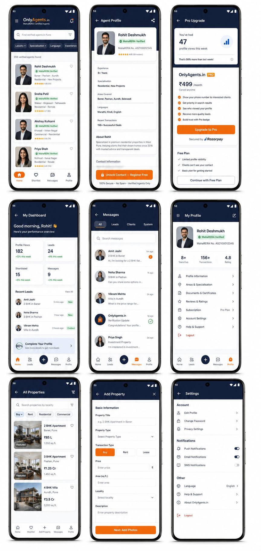
Onboarding → Search & Discovery → Agent Profile → Contact Gate → Pro Upgrade → Agent Self-Management Dashboard. All 60+ screens designed in Figma with auto-layout, component variants, and interaction prototypes before any Flutter code was written.
-
03
Designed the 3-tier verification badge system
Created a visual trust hierarchy displayed on every agent listing card: Verified MahaRERA (confirmed license active with the regulatory database), Active License (license valid but not enhanced-verified), and Pro Member (active subscription). The badges build immediate trust at the card level before a user even opens the profile.
-
04
Designed the freemium contact gate UX
Free users see agent name, photo, area, and specialisation. Contact details (phone, WhatsApp, email) are blurred until registration. The gate design shows a preview of what's behind it — not a hard wall. Users can see there's a phone number and WhatsApp button, just not the actual values. This preview-then-register pattern drove higher conversion intent than a blank "login to see" pattern.
-
05
Implemented UI directly in Flutter — widget code and theme system
Wrote Flutter widget code for all screens, managed the app theme (color tokens, typography scale, spacing system), and built custom components: agent listing cards, verification badge widgets, progress bars, the subscription paywall screen, and the Pro upgrade value-demonstration flow.
-
06
Designed advanced search filter UX
The filter system allows searching by locality, specialisation (residential / commercial / land), language spoken, years of experience, and MahaRERA verification status. Far more nuanced than typical agent directory filters which usually only offer area-based search. Designed as a bottom sheet with real-time count of matching results.
-
07
Designed the Pro upgrade screen as a value-demonstration flow
Rather than showing a features list paywall, the Pro upgrade screen shows agents their own profile metrics — profile views, contact request count, search appearances — with a "you're missing X connections per week because you're not Pro" message. Turns the paywall into a data-driven ROI argument. This pattern consistently drove higher upgrade intent in self-testing and beta feedback.
-
08
Integrated AdMob ads at natural pause moments
Ads were placed at three natural pause points: after viewing 3 agent profiles (interstitial), at the bottom of the search results list (banner), and on the "call completed" confirmation screen (interstitial). Avoided placements mid-profile, mid-flow, or at decision moments — keeping the experience feeling premium rather than cluttered.
OnlyAgents.in — Flutter Android App (2024–2025)
Design Thinking That Shaped the Product
Preview-Behind-Gate Freemium UX
A common freemium mistake is the "blank wall" — the user hits a paywall and sees nothing. I designed a "preview behind the gate" pattern: contact details are visible but blurred, with a semi-transparent overlay showing the lock. Users could see there is a phone number and WhatsApp button — they just couldn't read the values. This created desire (I can almost see it) rather than frustration (there's nothing here). The "register free" CTA directly below the blurred content converted at higher rates than a generic "sign in to see more" message.