A modern consumer real estate platform for a US boutique agency — property search with live map, Neighbourhood Intelligence layered insights, agent performance dashboard, and a Kanban offer tracker. Delivered as a complete design system implemented in React/Tailwind with Figma design tokens.
Boutique Agency, Modern Platform
Meridian Realty Group is an independent boutique real estate agency operating in Austin, Texas. They engaged Moonfire Private Limited / Pixelgeometry for a full platform redesign and rebuild — their existing website was a static property listing page with no search capability, no neighbourhood data, and no agent tools. The brief was ambitious: create a consumer-facing property search experience that could compete with Zillow and Realtor.com while preserving the boutique agency feel, and build agent-side tools that would replace a chaos of spreadsheets, email chains, and manual offer tracking.
I led UX strategy, information architecture, wireframing, UI design, and creative direction. I defined the design system (Tailwind CSS config, component library, design tokens) and worked closely with the React development team to implement it. The signature feature was Neighbourhood Intelligence — a layered data visualisation combining school ratings, commute times, walkability scores, crime index, and value trend data on a live map overlay, giving buyers contextual information they couldn't get from listings alone. The agent dashboard and offer Kanban were later additions driven by agent feedback during beta.
UX Lead, UI Designer & Creative Director
Research-Led, Token-Driven, System-First
Platform Architecture to Pixel Delivery
-
01
Led UX strategy and information architecture
Mapped three complete user flows — consumer property search, property detail with neighbourhood data, and agent-side tools — before any UI was designed. The IA decisions drove the entire React component hierarchy: Search Context, Property Context, and Agent Context as distinct application shells with shared component primitives.
-
02
Defined the Tailwind CSS design system as Figma design tokens
Defined the complete Tailwind config — color palette (Meridian emerald scale + neutral scale), typography scale, border radius tokens, shadow tokens, spacing scale — in Figma first, then exported to `tailwind.config.js`. This meant designers and developers worked from identical values. Zero drift between Figma mockups and production components.
-
03
Designed the property search + live map interface
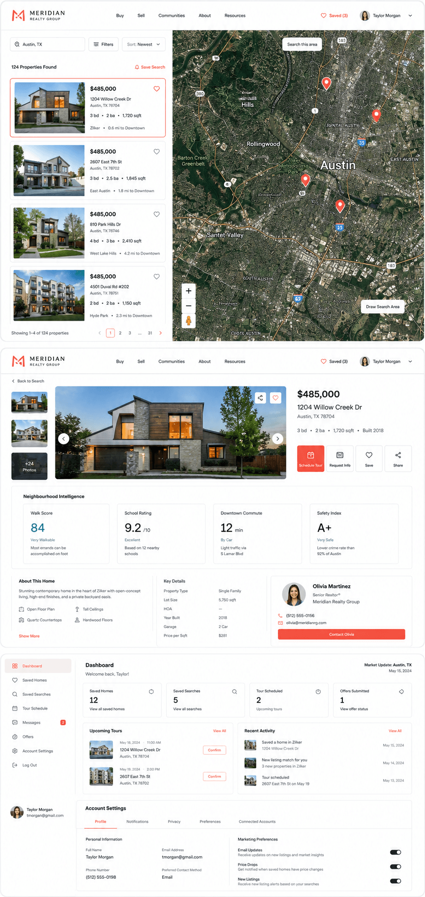
The split-view search interface — filter panel left, live Mapbox map right with property pins — was the most complex UX challenge. Map pins needed to show price without cluttering the map at scale. Designed a dynamic pin system: price labels at zoom 12+, clustered dots with count at lower zoom, with individual property cards appearing on click as a floating panel over the map rather than a page navigation. This kept users oriented in geographic context throughout their search.
-
04
Designed Neighbourhood Intelligence data layers
The signature differentiator: a toggle panel on the property detail view that overlays data layers on the map — School Ratings (district and specific school heat map), Commute (isochrone rings from the property by car/transit/walk), Walkability (Walk Score gradient overlay), Crime Index (low/medium/high heat map), and Market Value Trend (price per sq ft increase over 12 months). Each layer had a distinct colour range and a legend. Users could toggle multiple layers simultaneously. This was the feature Meridian agents said most impressed buyers during showings.
-
05
Designed the agent performance dashboard
A real-time agent view showing: active listings (with days-on-market indicators), upcoming tours (calendar strip), performance metrics (views/enquiries/conversion this month vs last), and a client pipeline summary. Designed to give agents a morning briefing at a glance — the most important information visible without scrolling on a 13" laptop. Replaced 3 separate spreadsheets Meridian agents were maintaining manually.
-
06
Designed the Offer Tracker Kanban
A Kanban board for tracking buyer offers across properties — columns: Draft, Submitted, Under Review, Counter-Offer, Accepted, Withdrawn. Cards show property address, offer amount, buyer name, and time-in-stage. Drag-and-drop between columns. Cards turn amber at 48h in stage, red at 72h. Designed specifically to make negotiation state visible at a glance rather than buried in email threads. This was added in sprint 3 based on direct agent feedback during beta.
-
07
Creative direction — brand visual language
Meridian's existing brand was minimal to the point of non-existence — a wordmark only. I defined their visual language: Meridian Emerald as the signature accent, clean sans-serif type (Inter), generous white space, and photography direction guidelines for listing images. The "boutique feel" was achieved through white space discipline and card typography — not decoration. The design feels distinct from Zillow's information-density without sacrificing search utility.
Meridian Realty — React / Tailwind Web App (2023–2024)
Design Thinking That Shaped the Platform
Neighbourhood Intelligence as the Core Differentiator
Boutique agencies can't out-data Zillow on listings — they'll always have fewer properties indexed. The differentiation had to come from insight, not volume. Neighbourhood Intelligence was designed as a layer system: contextual data overlaid on a map view that gave buyers answers they couldn't get from listing photos and square footage figures alone. The toggle-layer approach (vs a single combined score) let buyers prioritise what mattered to them — a family would weight schools heavily; a young professional might weight walkability and commute. This wasn't about adding data; it was about making data personally relevant.