Led UI architecture and functional specification for a global risk and insurance management system — 80+ screens across 6 core modules, zero JS framework, IE8-compatible, used daily by Morgan Stanley's worldwide risk teams.
Managing Risk at Global Scale
RIMS (Risk & Insurance Management System) was a large-scale internal web application used by Morgan Stanley's global risk and insurance teams to track, manage, and report on corporate insurance policies, claims, and risk exposure across multiple asset classes. The system sat at the intersection of legal, finance, and operations — requiring meticulous attention to data hierarchy, role-based access, and compliance-heavy workflows.
The application was delivered via Capgemini India's Pune delivery centre to Morgan Stanley's US-based product owners. I joined as UI Functional Lead, responsible for translating complex business requirements from New York-based stakeholders into detailed screen designs, functional specifications, and a front-end component system that offshore Java developers could implement reliably. The system handled multi-role access — viewers, managers, and approvers — with compliance audit trails for every action.
Leading UI from Discovery to QA
From Stakeholder Workshops to Production QA
What I Built and Delivered
-
01
Led UI design for 6 core modules — 80+ screens
Owned end-to-end design for Policy Registry, Claims Tracker, Risk Dashboard, Reports Builder, Admin Panel, and Audit Log. Each module required its own data model, interaction patterns, and role-sensitive display logic.
-
02
Stakeholder workshops with US-based Morgan Stanley product owners
Facilitated weekly video-call sessions with New York BAs to gather, clarify, and validate requirements. Translated ambiguous business rules into detailed UI functional specifications.
-
03
Built a reusable enterprise component library
Designed and documented 22 reusable components: inline-edit data tables, multi-step form wizards, collapsible filter panels, status badge system, alert banners, and context-sensitive toolbars — all IE8-compatible.
-
04
Produced detailed UI specification documents for dev team
Wrote 200+ page functional UI specification covering all screen states, interaction rules, validation messages, API data binding requirements, and accessibility notes for the Pune Java/.NET development team.
-
05
Cross-browser QA — tracked and resolved 140+ UI bugs
Ran systematic QA across IE8, Firefox 3.6, and Chrome. Logged defects in the project tracking system with reproduction steps and screenshots. Achieved 100% bug closure before production deployment.
-
06
Collaborated with backend developers on API data structures
Worked directly with Java/.NET developers to define JSON/XML response structures that matched the UI's data binding requirements — preventing late-stage integration issues across 6 modules.
-
07
Presented UI prototypes in fortnightly Morgan Stanley stakeholder reviews
Prepared and delivered interactive HTML/CSS prototypes for review calls with Morgan Stanley product owners in New York. Incorporated feedback into revised designs within same-week turnarounds.
-
08
Designed a role-based navigation and permission system
Built a UI-level access control pattern that showed or hid modules based on the user's role (Viewer, Manager, Approver, Admin) — reducing cognitive load and preventing inadvertent access to sensitive functions.
The Interface — 2010–2012 Enterprise Portal
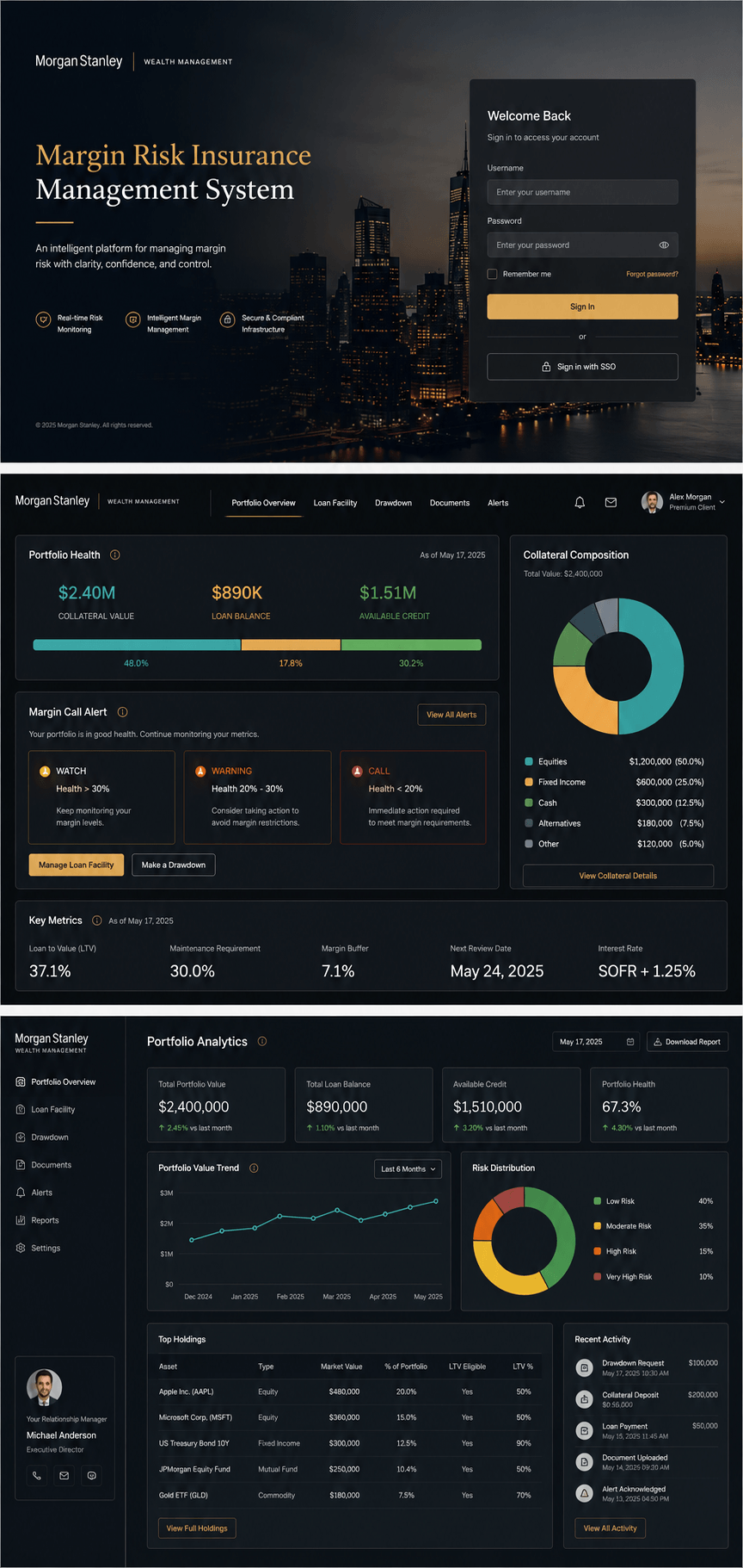
Where Design Thinking Made the Difference
Role-Based Navigation Hiding
RIMS had three user roles with different access levels: Viewers could only see data, Managers could create and edit, Approvers could authorize claims. Rather than showing disabled nav items with lock icons (which confused users in testing), I designed a system that completely hid modules the current user couldn't access. A Viewer logging in saw a simple, focused interface — not a locked-down version of a complex one.