Designed a tablet-optimised branch operations tool for Citibank Australia branch managers — Daily Focus view replacing 5 spreadsheets, compliance progress rings turning anxiety into completion, 45+ screens across desktop and iPad.
Replacing Spreadsheets with a Smart Branch OS
This project involved designing a web-based branch management application for Citibank Australia's retail banking operations. Branch Managers used the tool to oversee daily operations: staff performance tracking, customer appointment management, product sales pipeline, compliance task checklists, and end-of-day reporting. Before this application, managers relied on a fragmented mix of Excel spreadsheets, email chains, and manual checklists — a system that was error-prone, time-consuming, and impossible to audit.
The application needed to work on both desktop browsers (1280px and 1024px) and tablet (iPad 2) which managers used on the branch floor while walking around. I joined the project at the discovery phase — conducting remote contextual inquiry sessions where I observed branch managers in their actual working environment, watching how they navigated between Excel sheets, post-it notes, and phone calls. Three user types required distinct but overlapping experiences: the Branch Manager who ran the daily operation, the Assistant Manager who focused on sales and appointments, and the Area Manager who reviewed aggregate data across multiple branches.
Discovery Through UAT — Full UX Ownership
From Contextual Inquiry to iPad-Ready UI
What I Built and Delivered
-
01
Contextual inquiry — observed branch managers in their real workflow
Conducted remote observation sessions watching branch managers navigate their existing Excel-based tools. Documented 12 distinct pain points including context-switching between 5 spreadsheets and the inability to get a consolidated daily overview without manual data collation.
-
02
Created 3 user personas with distinct workflow needs
Personas for Branch Manager (daily operations overview, compliance, end-of-day reporting), Assistant Manager (sales pipeline, appointment scheduling), and Area Manager (cross-branch aggregate data, regional compliance). Each persona had a distinct primary use case that shaped navigation hierarchy decisions.
-
03
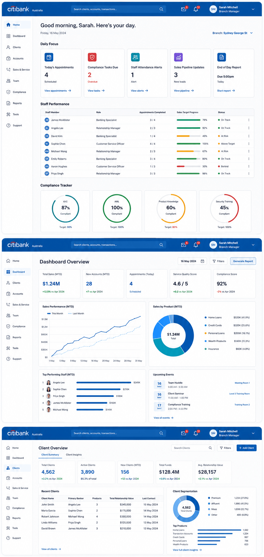
Designed the "Daily Focus" morning briefing screen
Branch Managers told us their #1 pain was not knowing what to prioritize each morning without opening 5 different spreadsheets. I designed a single "Daily Focus" view that surfaced the 5 most critical items for that day — compliance deadlines, urgent appointments, sales targets, alerts, and a weather indicator for footfall prediction.
-
04
Tablet-optimised layout for iPad 2 use on the branch floor
Designed a parallel tablet layout: same data, but reorganised into single-column touch-friendly format with larger tap targets (44px minimum), swipeable card panels, and collapsible sections. Tested and refined directly on iPad 2 hardware with iOS 6. Breakpoints: 1280px desktop, 1024px laptop, 768px tablet.
-
05
Compliance tracker with visual progress rings
The original compliance tracker was a scrollable checklist — managers described it as "anxiety-inducing" in research. I redesigned it with circular progress rings (0–100% per compliance category) that turned the experience into something that felt like progress, not a list of things you hadn't done yet. Similar to a fitness tracker pattern applied to compliance.
-
06
Created 30 custom branch operations icons
Designed a consistent set of 30 custom icons for branch-specific concepts (teller, compliance, appointment, target, vault, customer escalation, etc.) aligned to Citibank's brand guidelines. Delivered as SVG sprites for crisp rendering at all screen sizes and pixel densities.
-
07
Participated in UAT sessions and translated tester feedback
Attended UAT sessions with real Citibank Australia branch managers, observed their interaction with the prototype on both desktop and iPad, and translated their feedback into specific UI refinements. Completed 3 full UAT iteration rounds before sign-off.
Branch Operations Portal — 2013–2014
Design Thinking That Shaped the Product
Compliance as Progress, Not a Checklist
In user research, branch managers described the compliance checklist as "stressful" and "impossible to feel good about." The traditional list format showed everything you hadn't done. I reframed the interaction using circular progress rings — a pattern borrowed from fitness apps — where each compliance category (AML, KYC, Product Certifications, Branch Audit) showed a 0–100% completion ring. A full ring felt like an achievement. A partially-filled ring showed clearly what remained, and the visual momentum encouraged completion. Compliance completion rates reportedly improved in post-launch feedback.